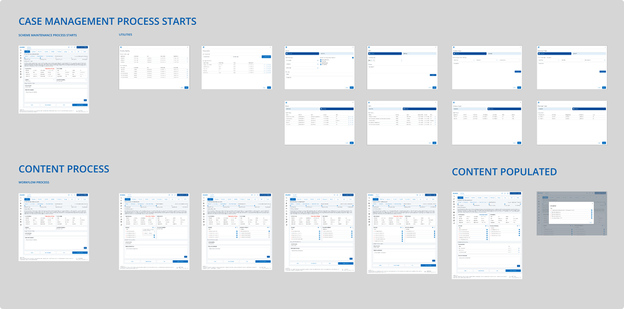
Product Design
From UX research, wireframes and user flows to high-fidelity UI design and interactive prototypes. I know how to balance business goals with user needs, and I’m just as comfortable mapping journeys as I am polishing pixels. Whether it's shaping product strategy or jumping into Figma, I’m all about building useful, usable, and beautiful digital experiences. In this section, you’ll find a collection of case studies that showcase different parts of my process, from wireframes and prototypes to user journeys, personas, and app store artwork. Each project highlights deferent elements of product design, combining strategy, creativity, and hands-on execution to bring ideas to life.

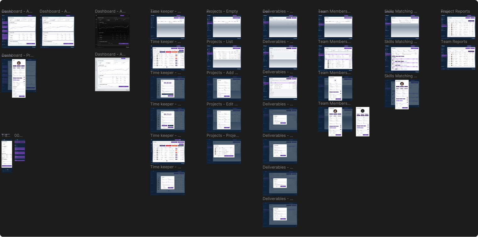
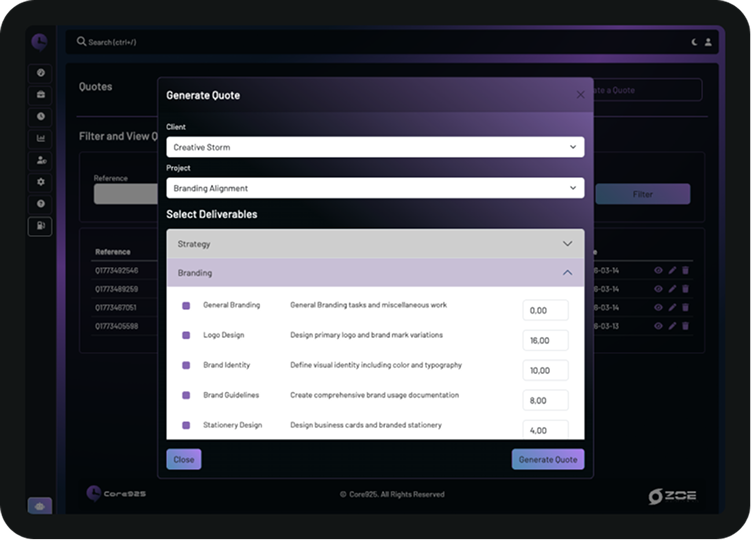
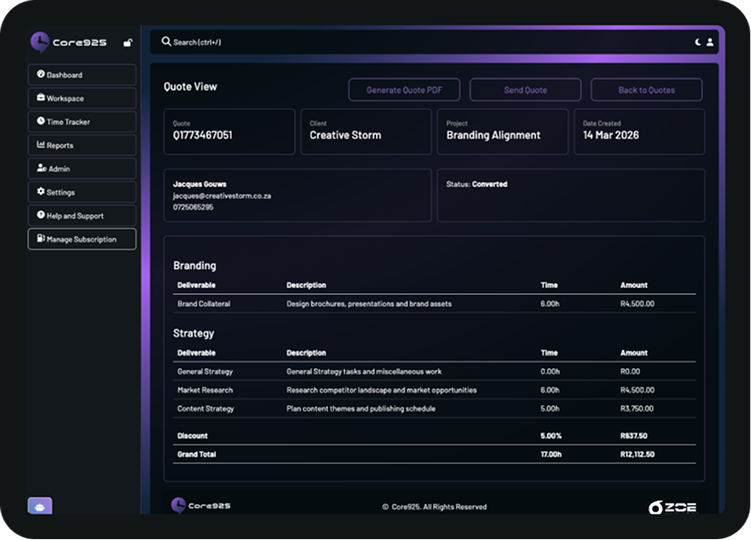
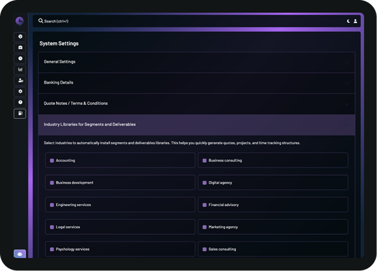
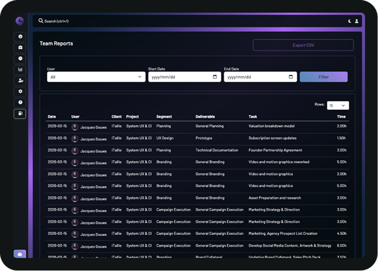
Core925
The platform goes beyond traditional time tracking by providing visibility into how work is delivered, where time is spent, and how that translates into billing and profitability. It enables freelancers, agencies, and consulting teams to reduce revenue leakage and improve operational efficiency through a connected workflow.
Figma | HTML | CSS | Bootstrap | PHP (MVC) | MySQL | JS
Gain insights
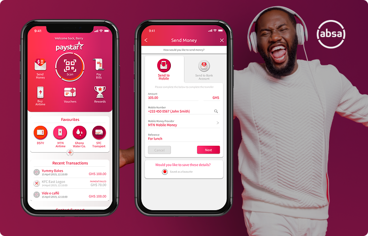
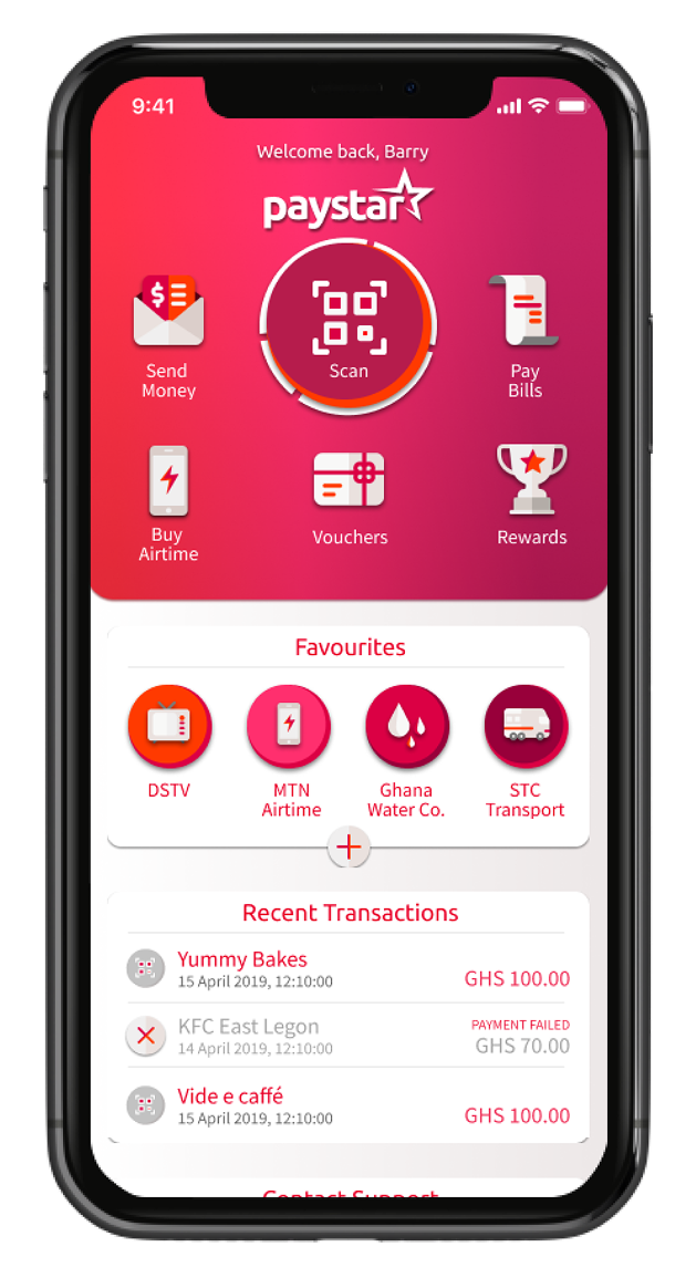
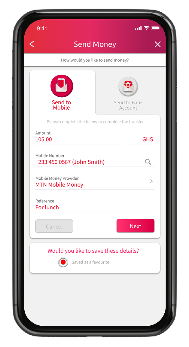
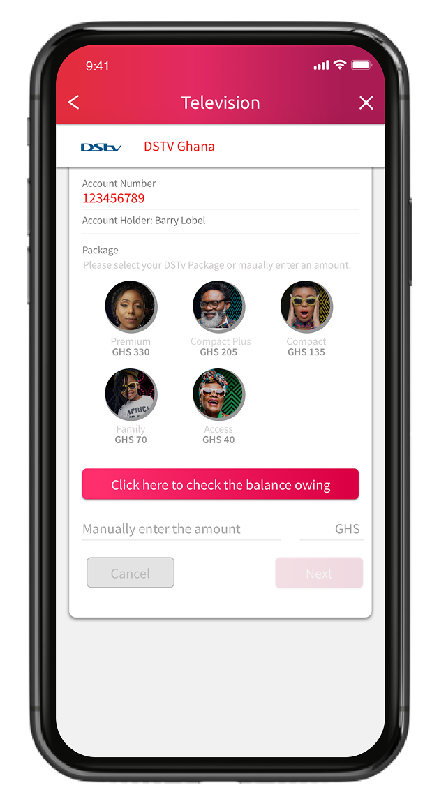
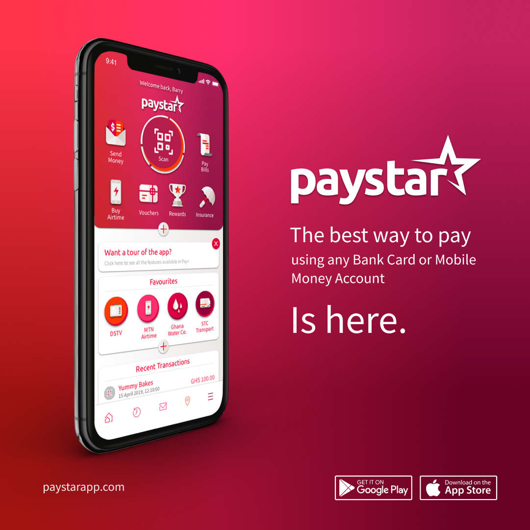
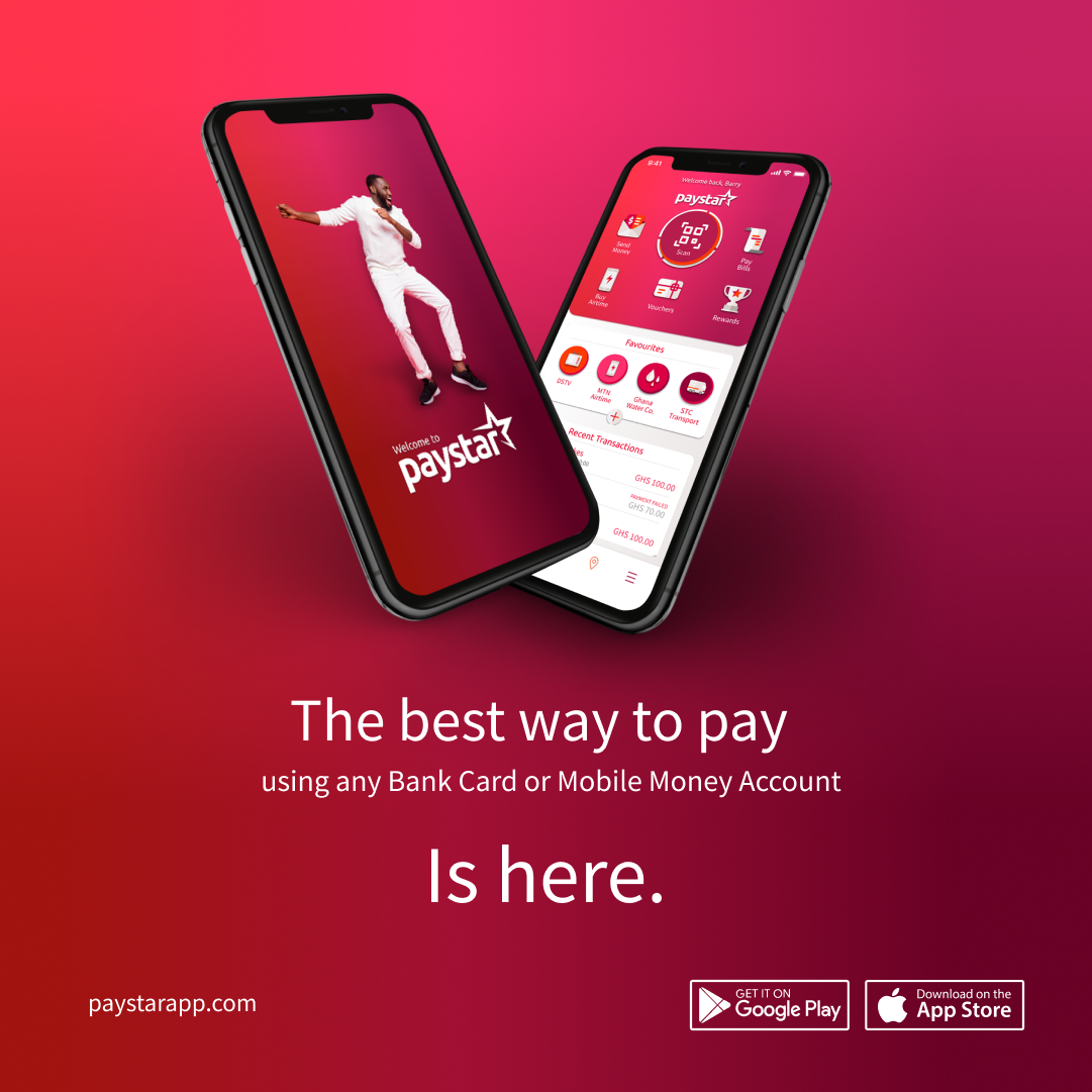
ABSA / PAYSTAR
Absa Group Limited, and originally Amalgamated Banks of South Africa, is a South African-based financial services group, offering personal and business banking, credit cards, corporate and investment banking, wealth and investment management, as well as bank assurance.
FIGMA / SKETCH / OVERFLOW / JIRA
Gain insights
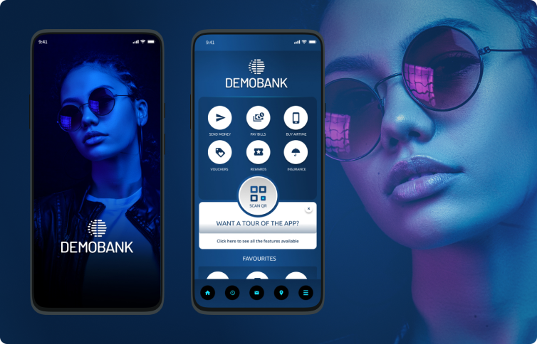
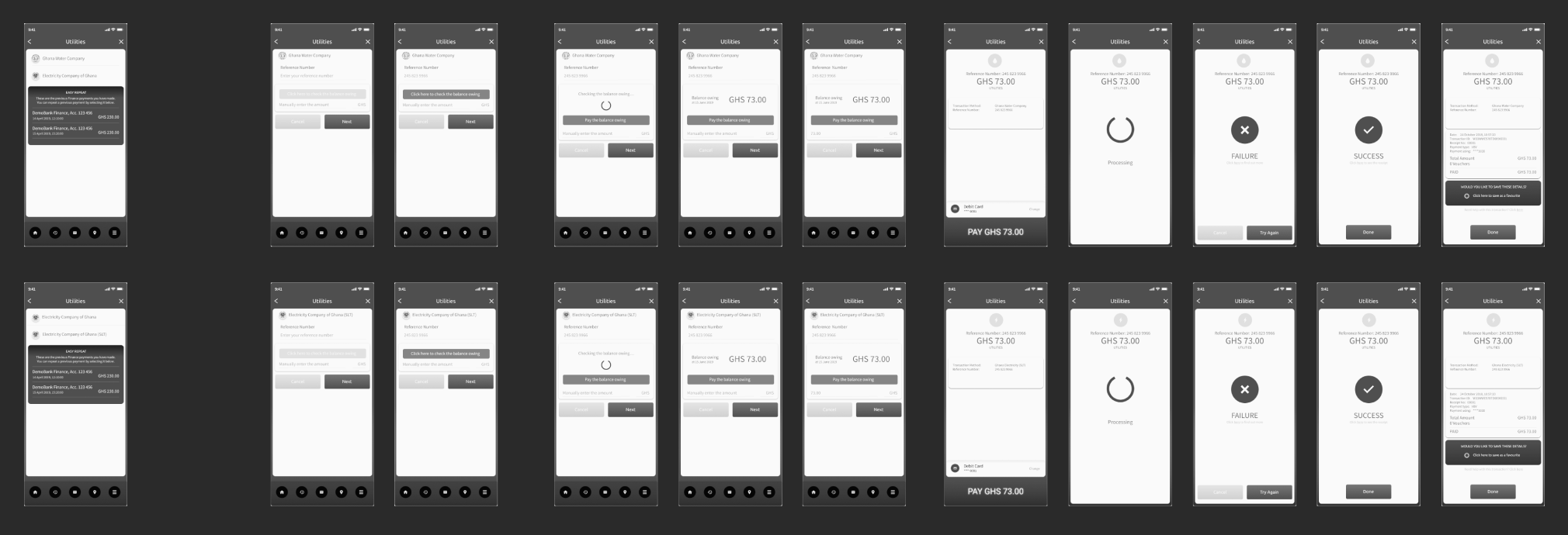
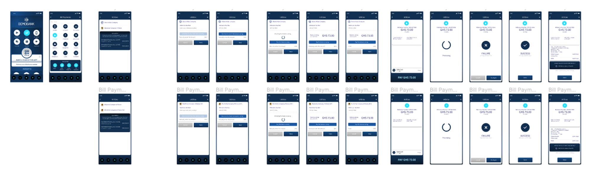
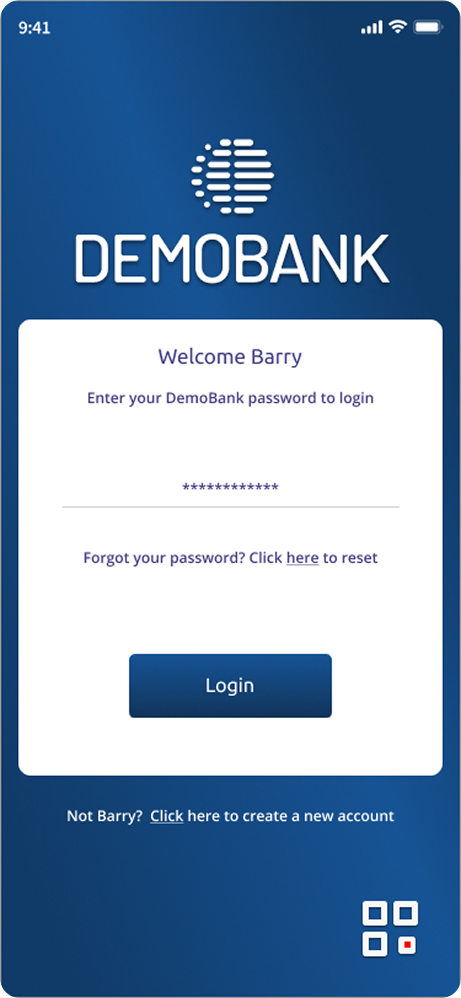
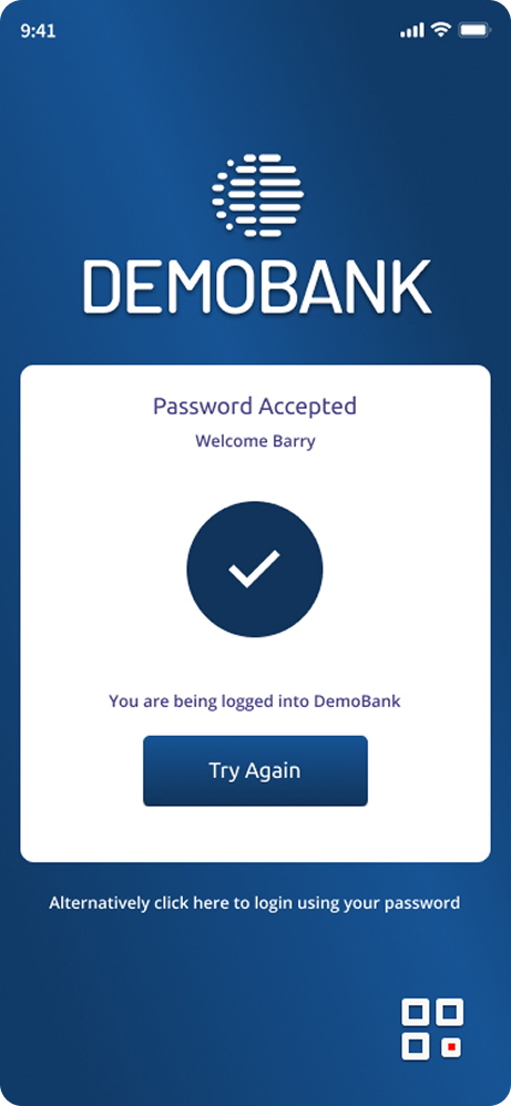
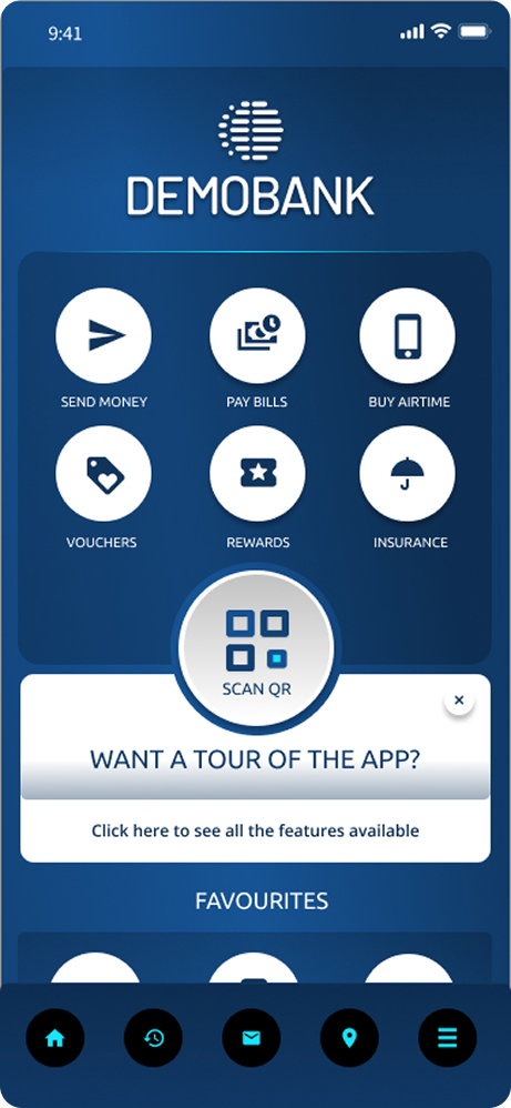
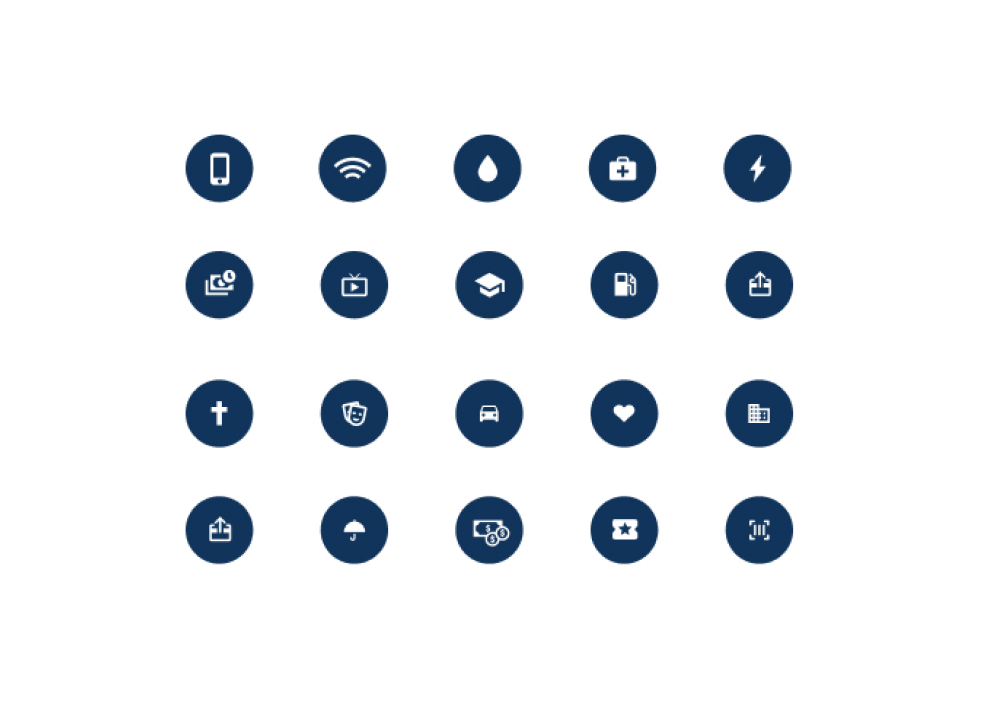
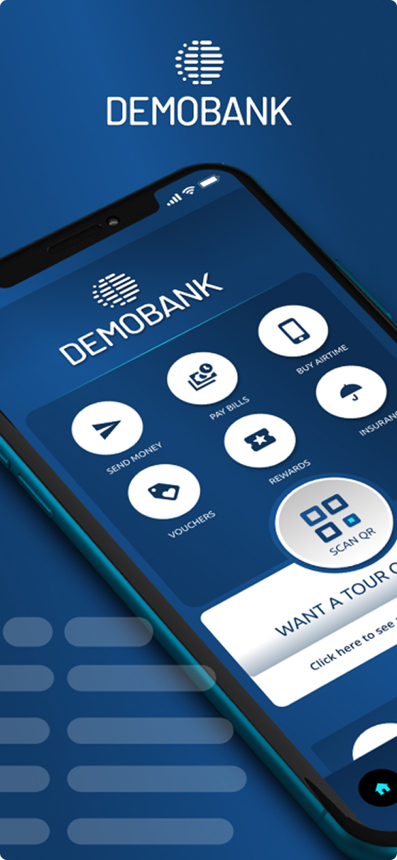
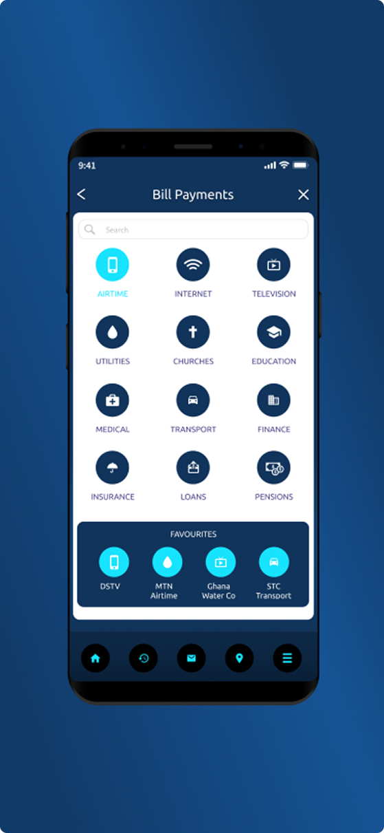
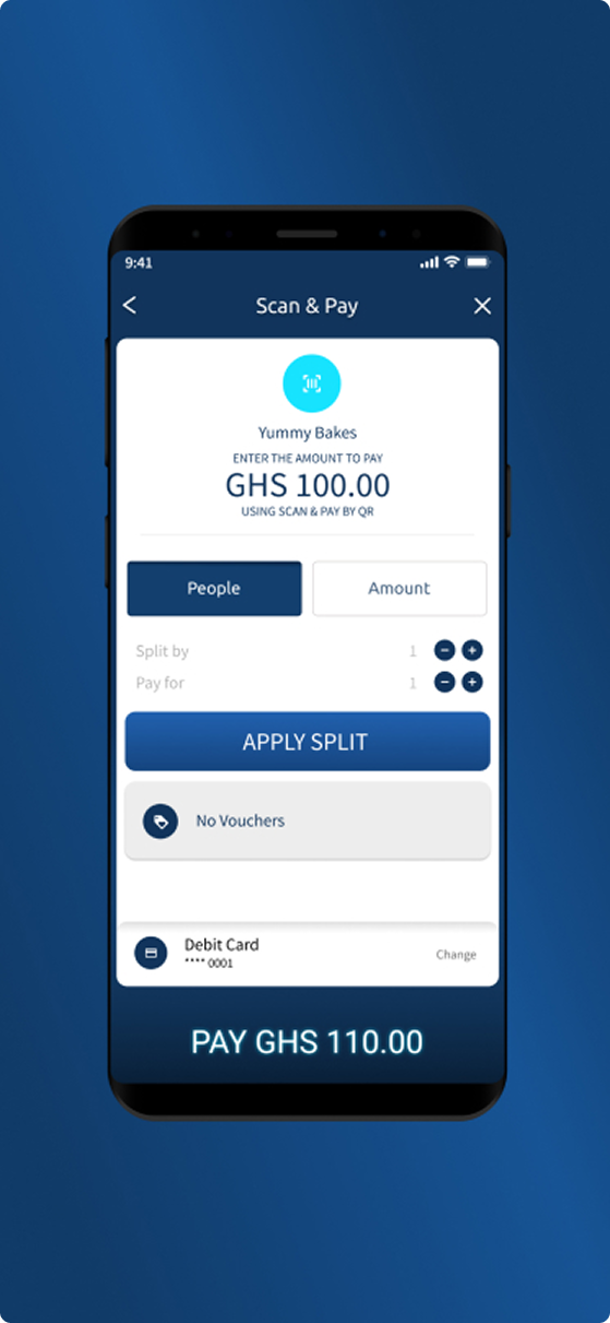
ZAPP GROUP / DEMO BANK
DemoBank was created with the aim of developing a white-label application that could be showcased to clients. The application utilizes Zapper QR payment technology and has been designed to be compatible with IOS, Android, and KaiOS platforms.
FIGMA / SKETCH / OVERFLOW / JIRA
Gain insights
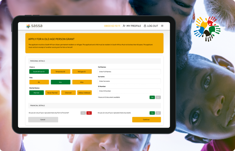
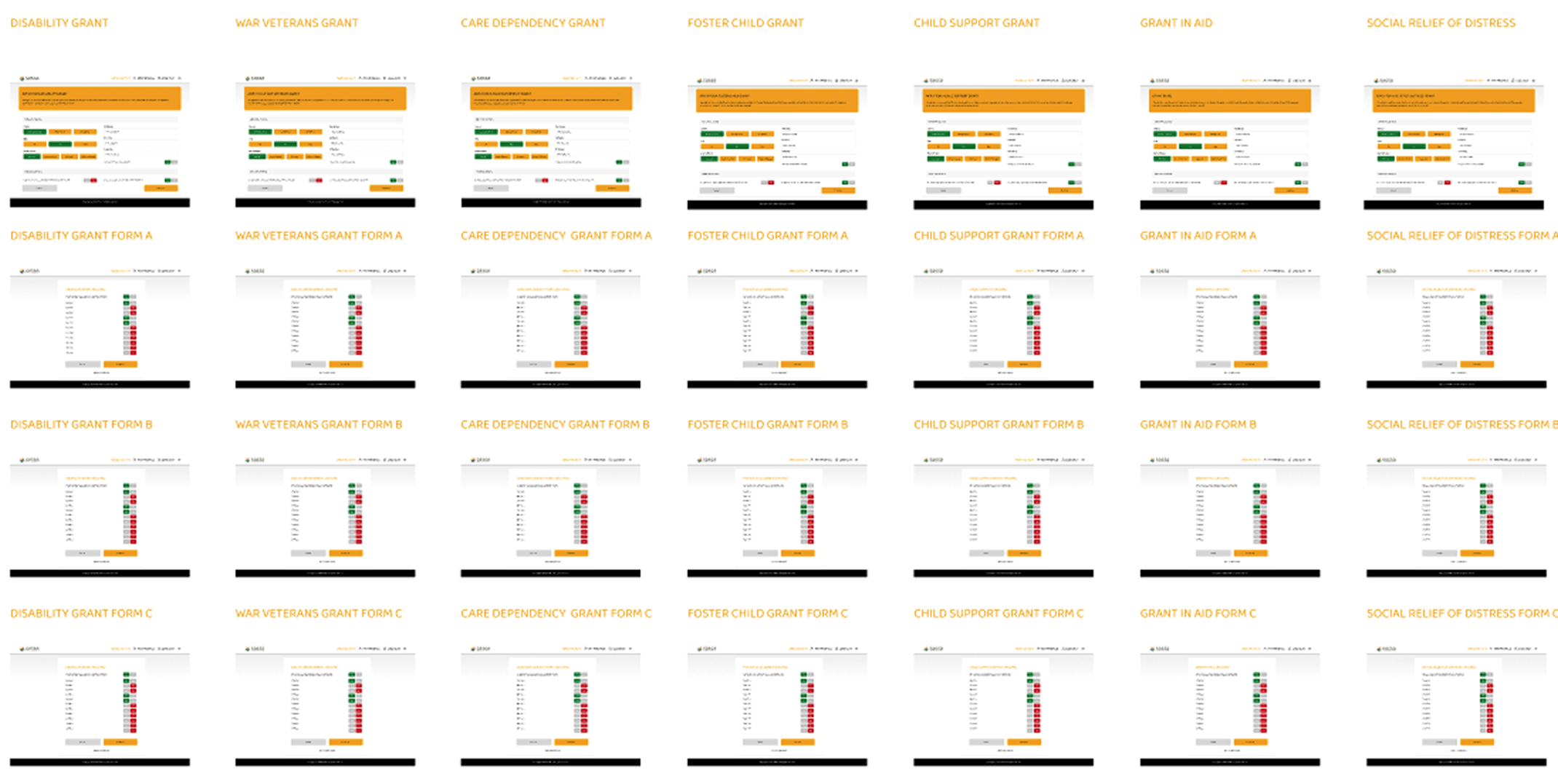
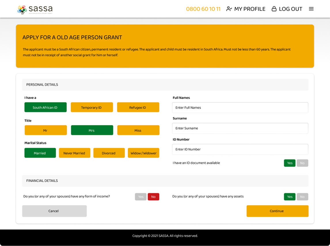
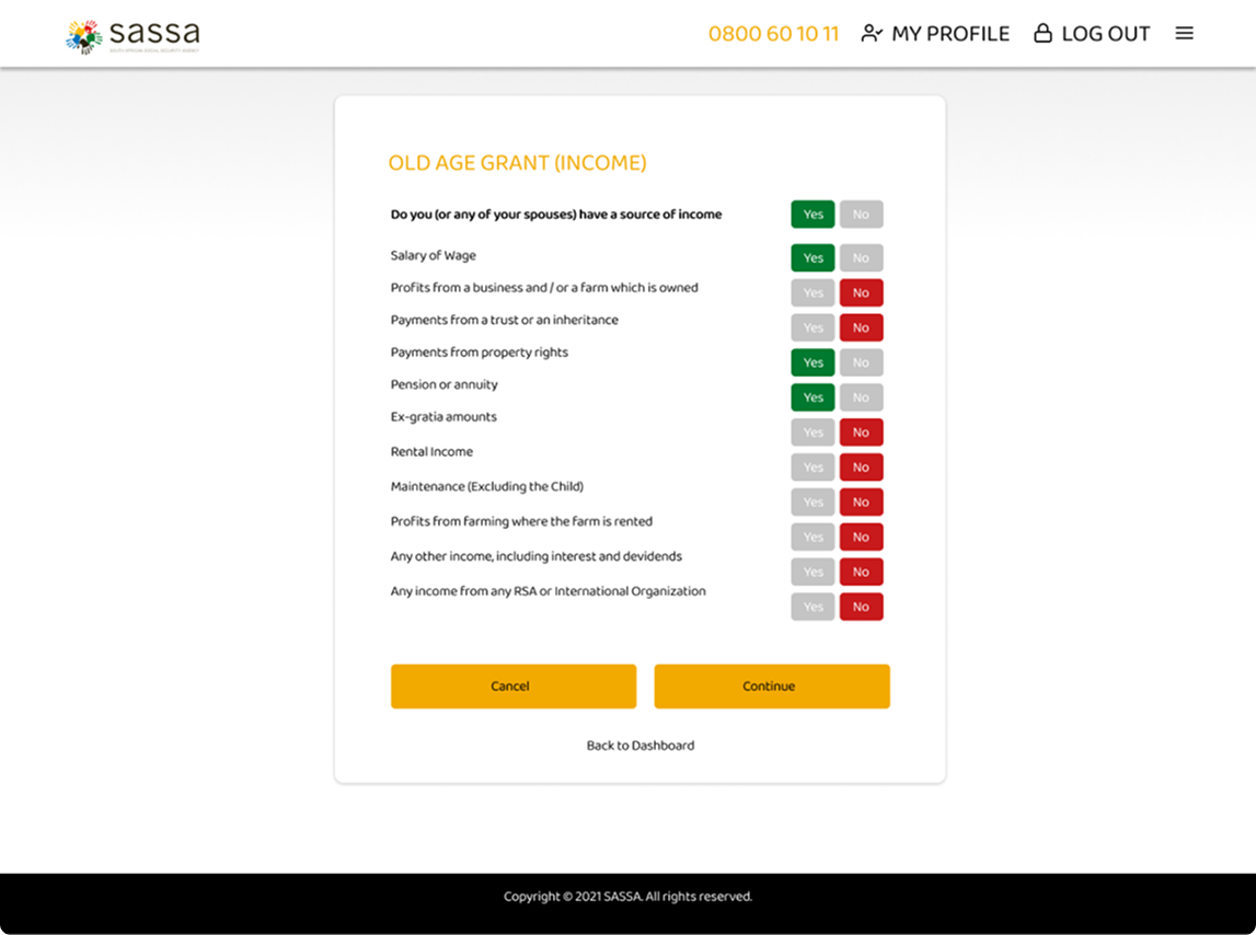
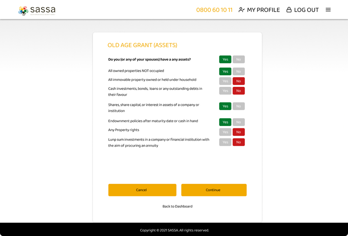
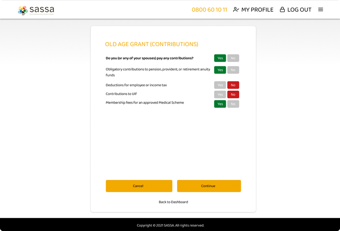
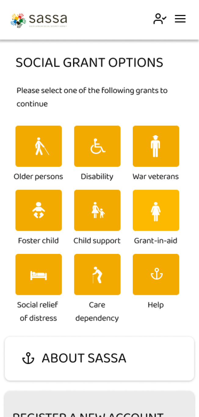
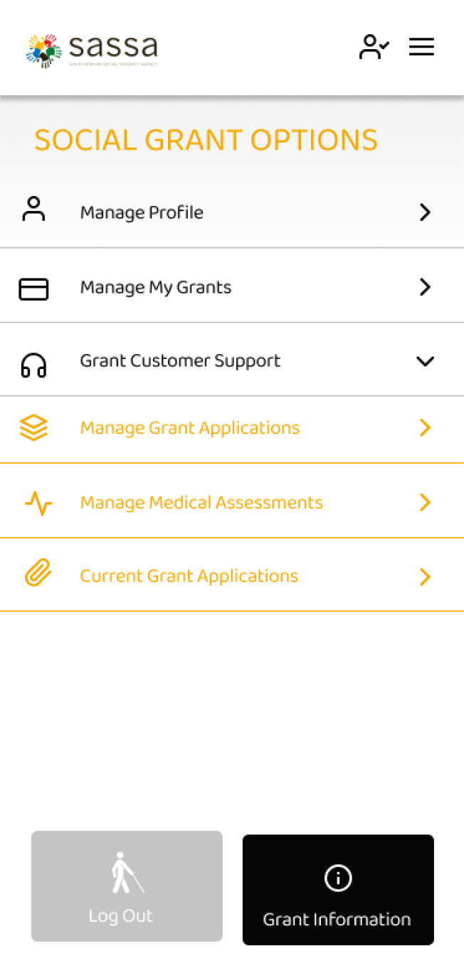
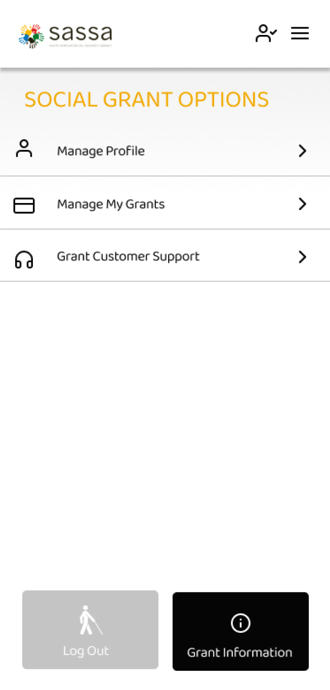
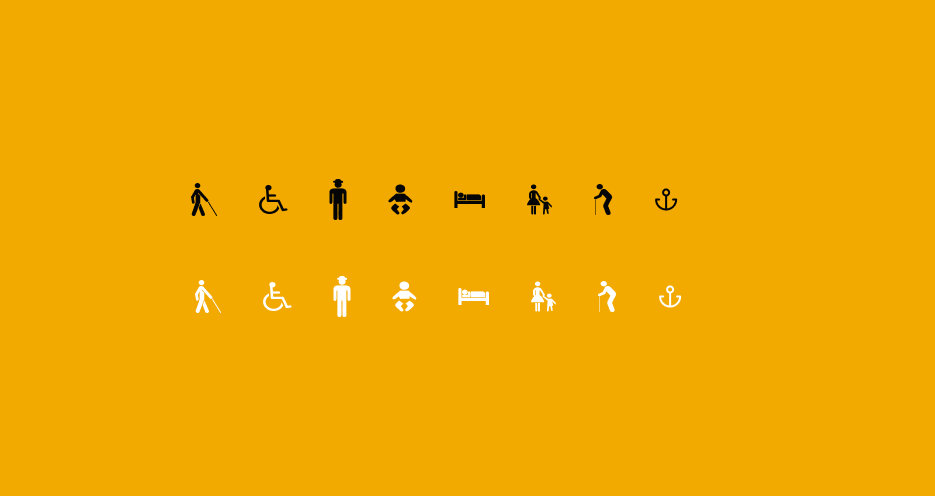
SASSA
South African Social Security Agency is a national agency of the South African government created in April 2005 to administer South Africa's social security system, including by distributing social grants, on behalf of the Department of Social Development.
FIGMA / HTML / CSS
Gain insights
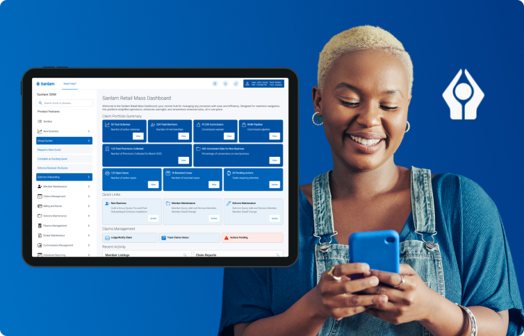
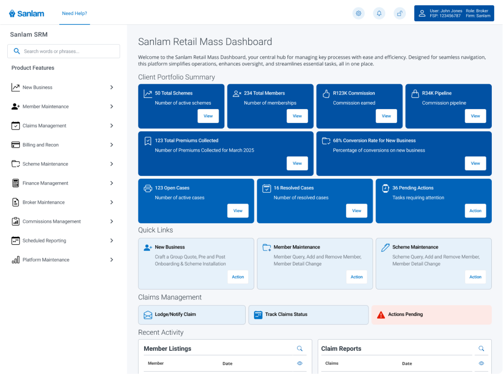
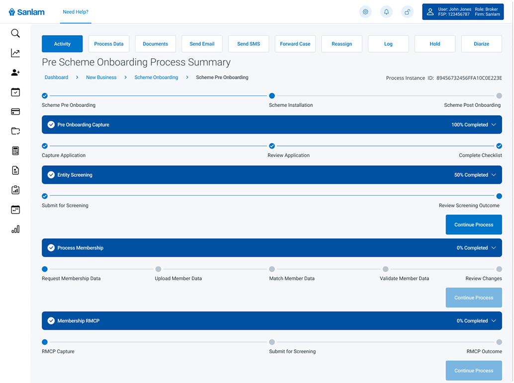
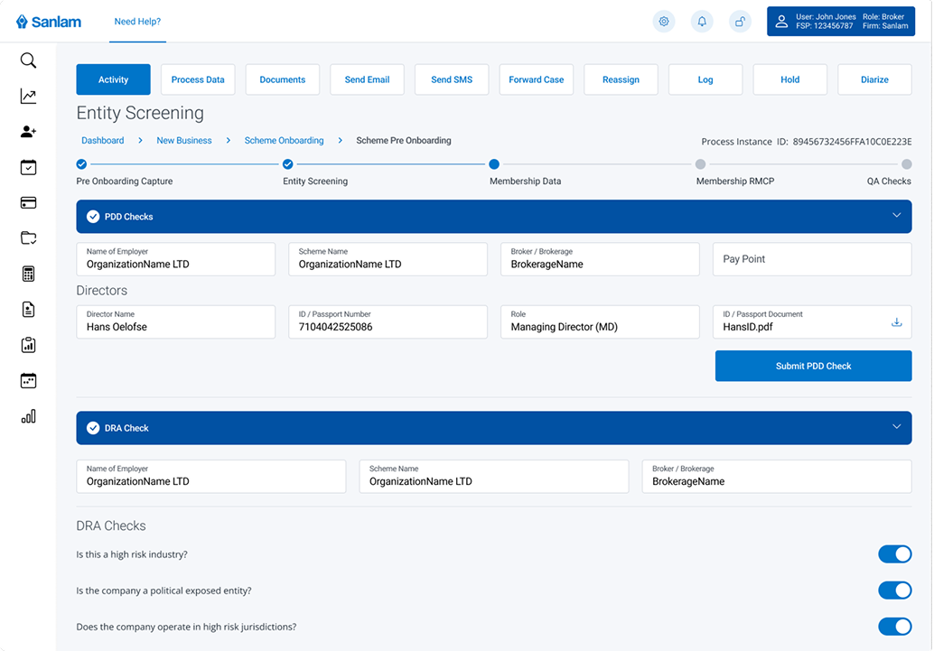
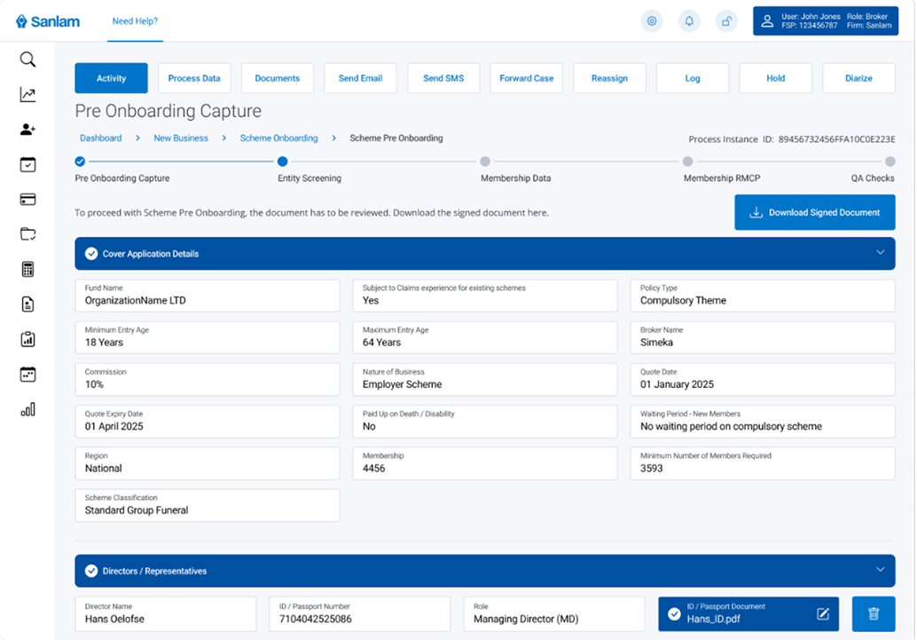
SANLAM
Sanlam is a South African financial services group established in 1918. It provides a wide range of financial products and services, including life insurance, general insurance, investment management, financial planning, retirement, and wealth management. Sanlam operates across several countries in Africa and internationally, with its headquarters located in Bellville, Western Cape, South Africa.
FIGMA
Gain insights