Front End Development
From clean HTML and CSS to dynamic interactions with jQuery and Bootstrap, I enjoy turning ideas into fully functional digital experiences. I focus on writing responsive, accessible, and efficient code that brings designs to life without losing the details that make them shine. Whether it’s a WordPress site or a custom Bootstrap template, I care about performance, usability, and making sure everything looks just as good in the browser as it does in the prototypes. In this section, you’ll find case studies that showcase my approach to front-end development, including WordPress websites and a Bootstrap framework built for scalability.

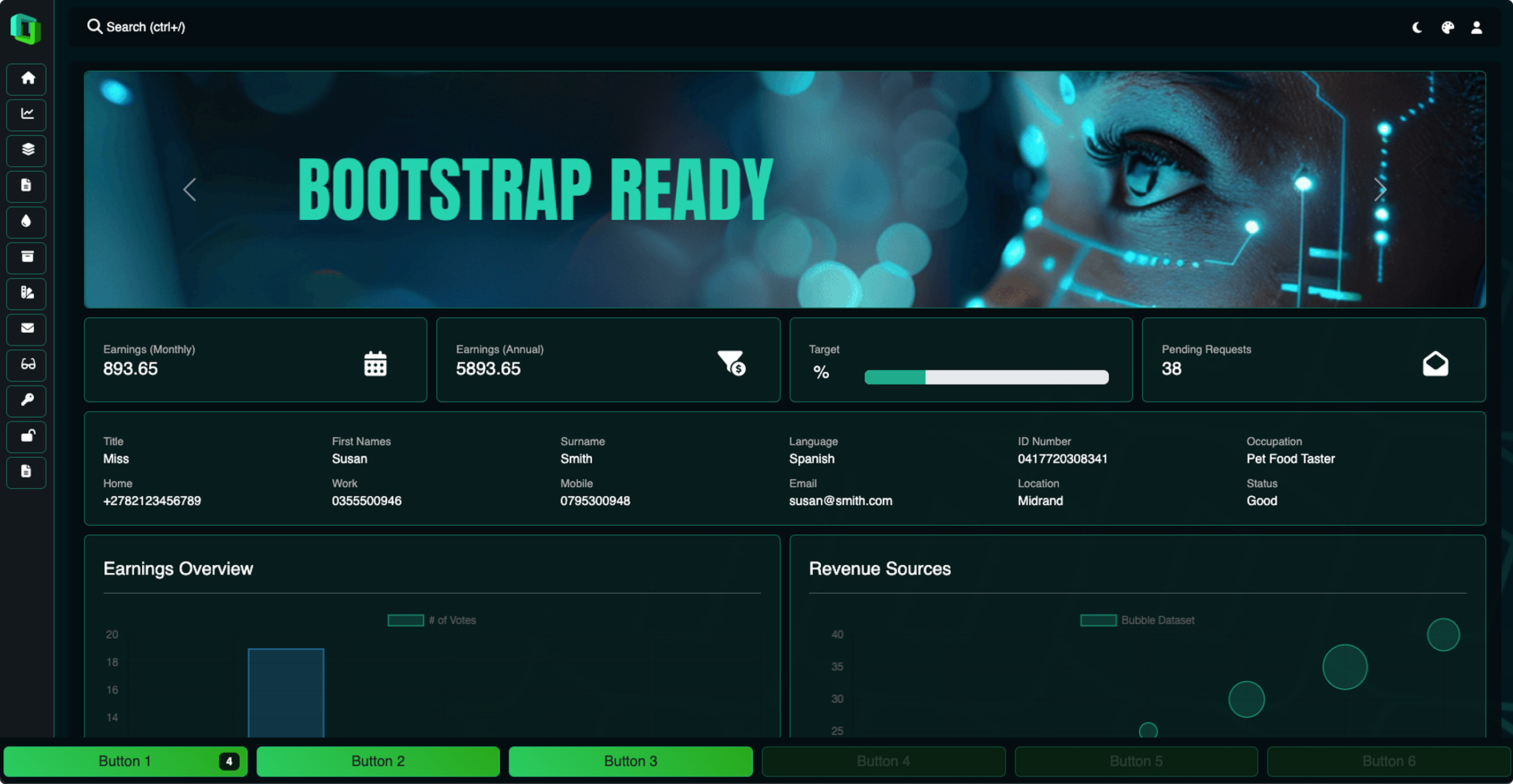
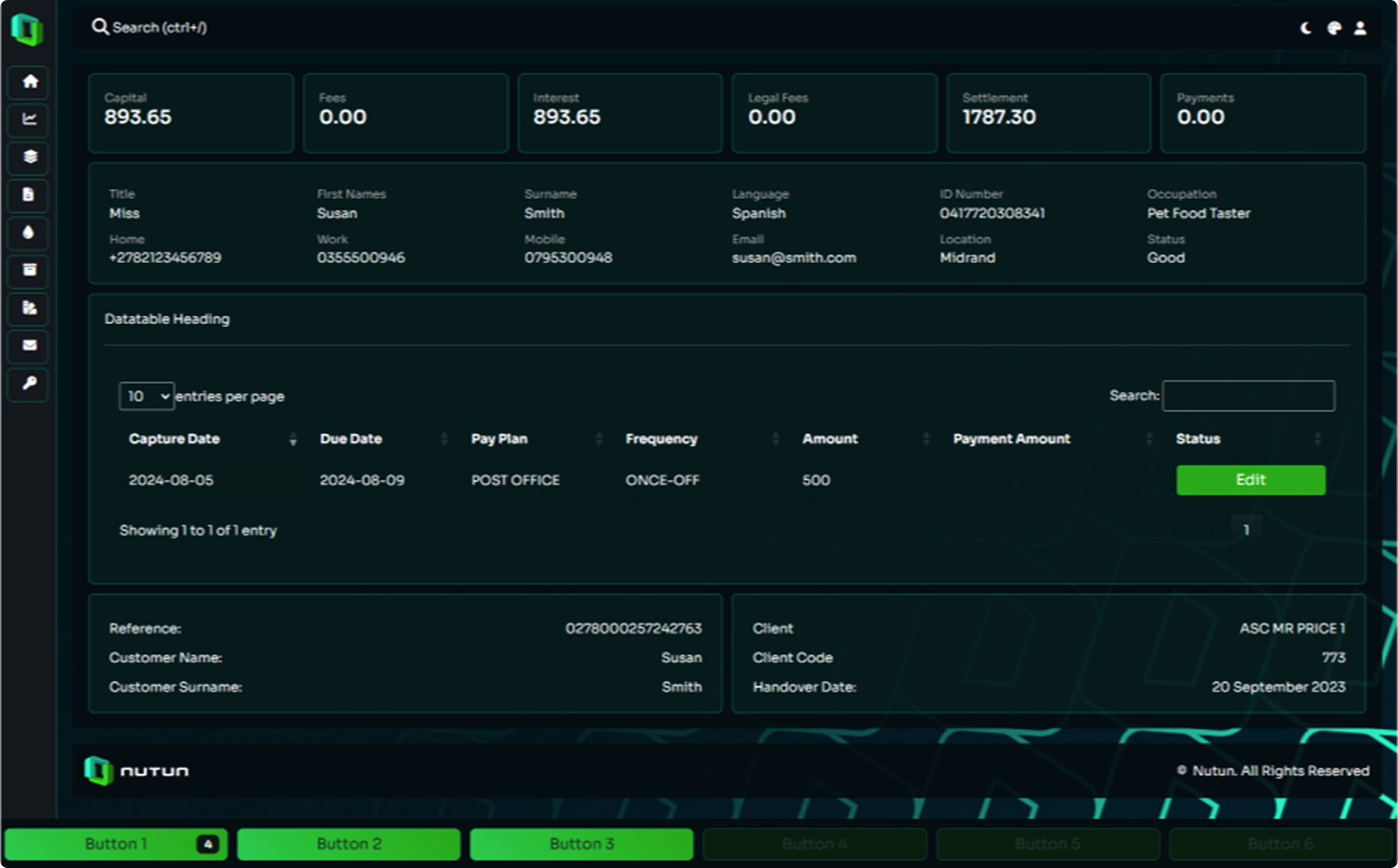
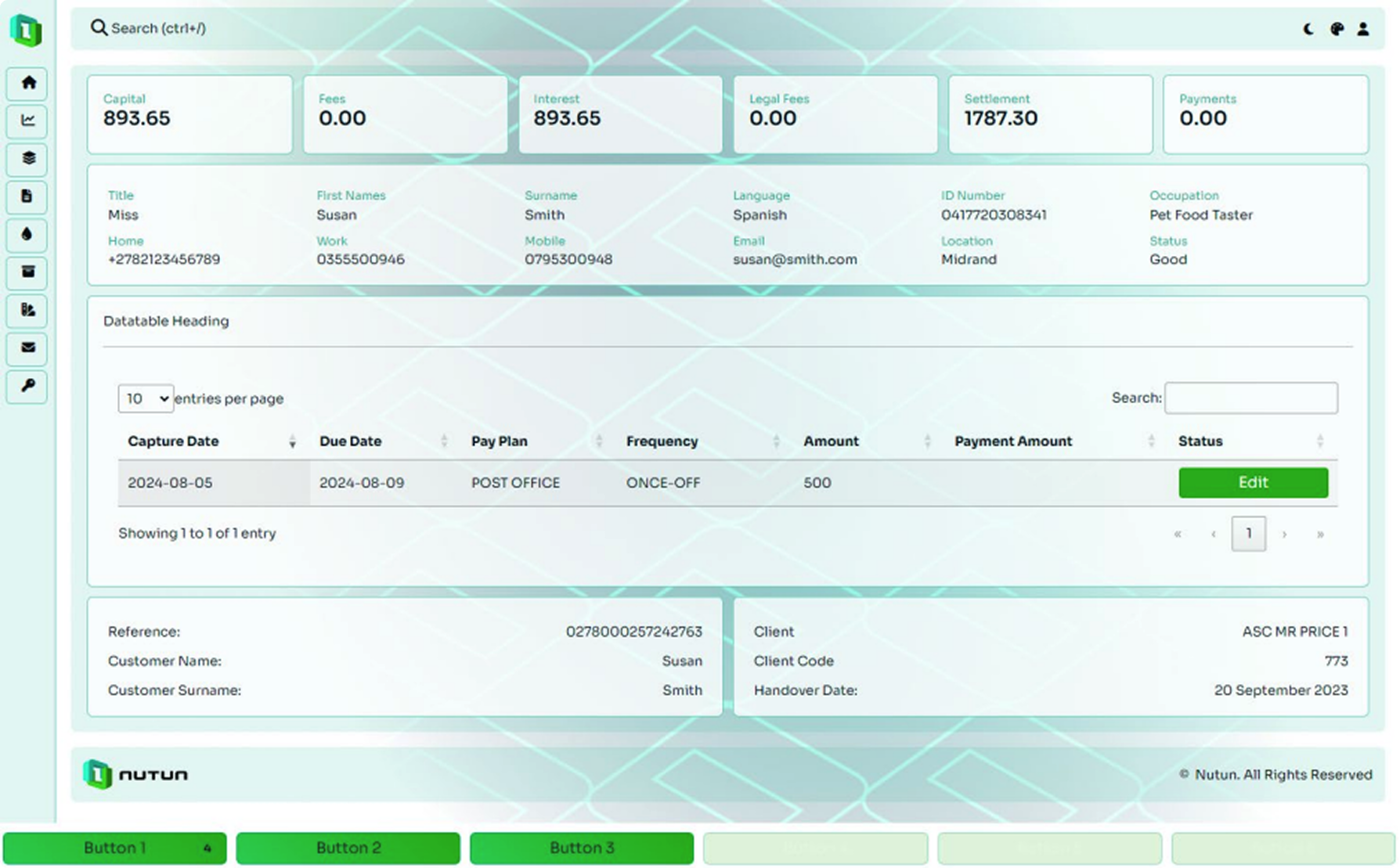
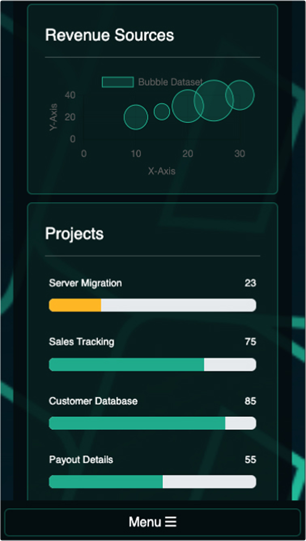
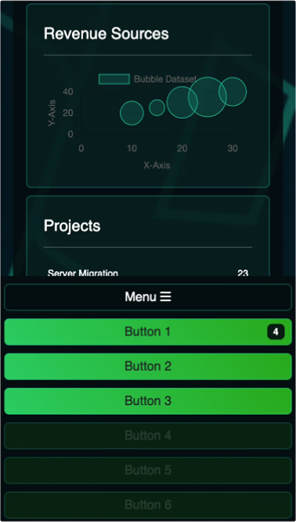
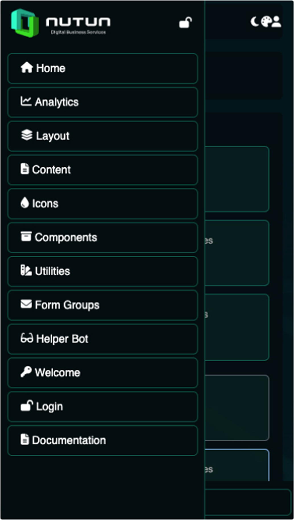
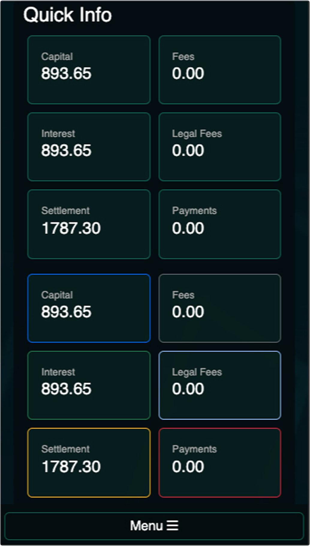
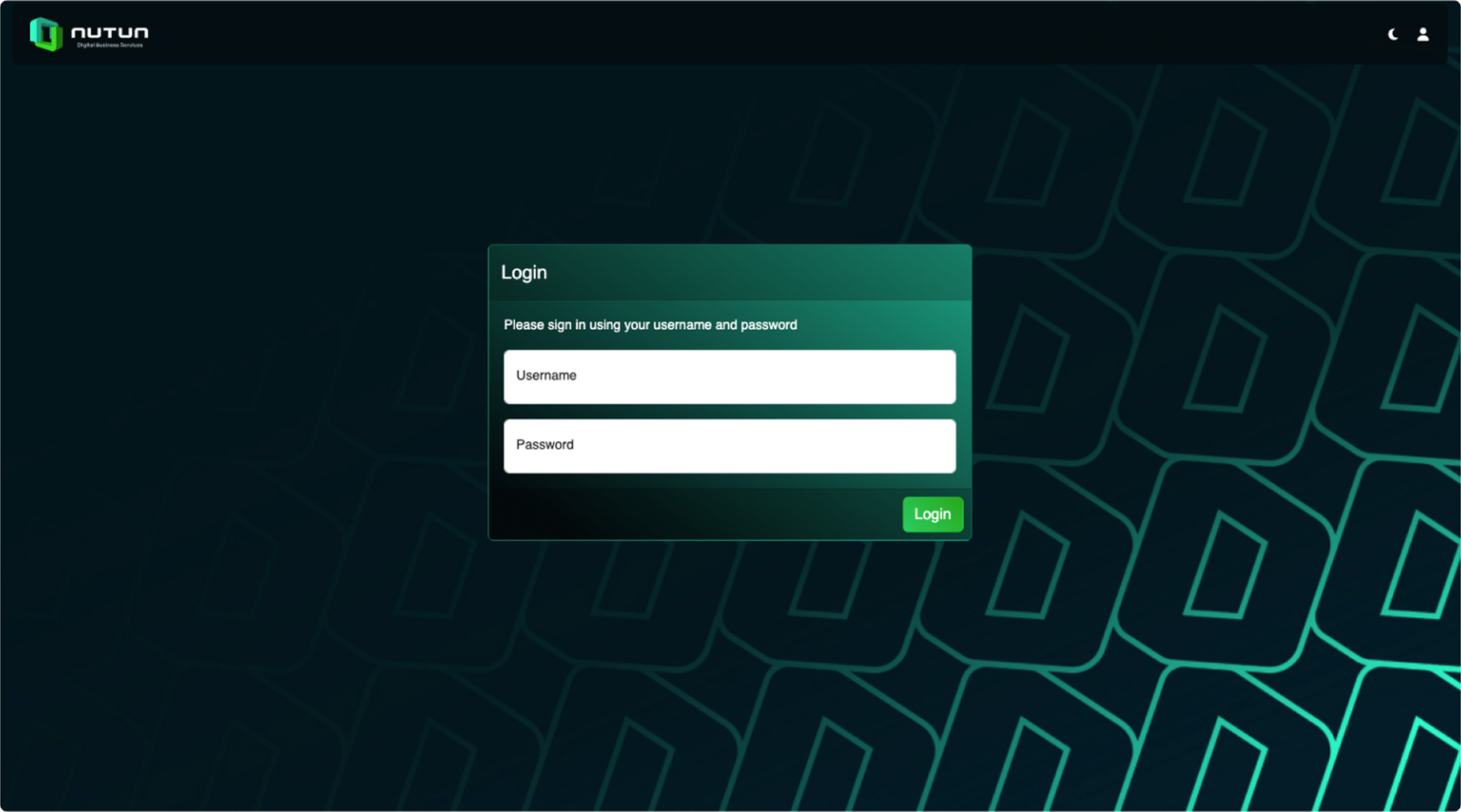
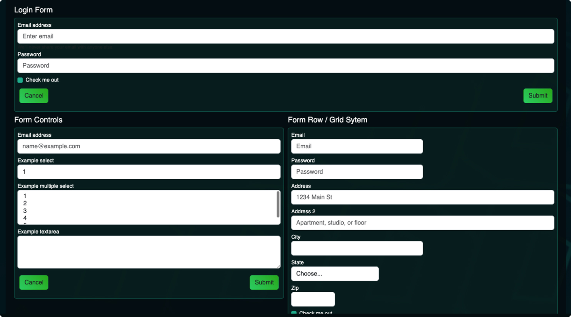
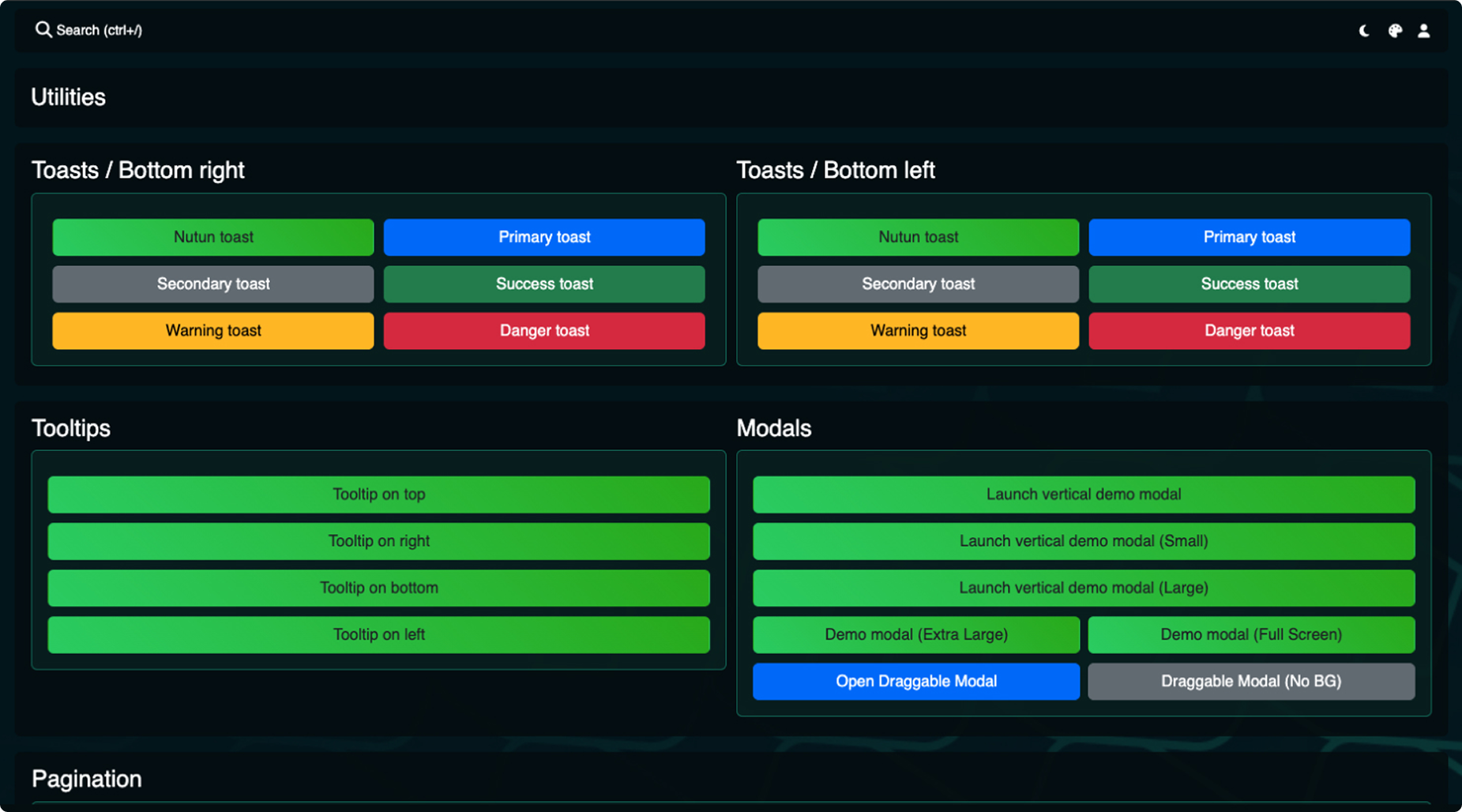
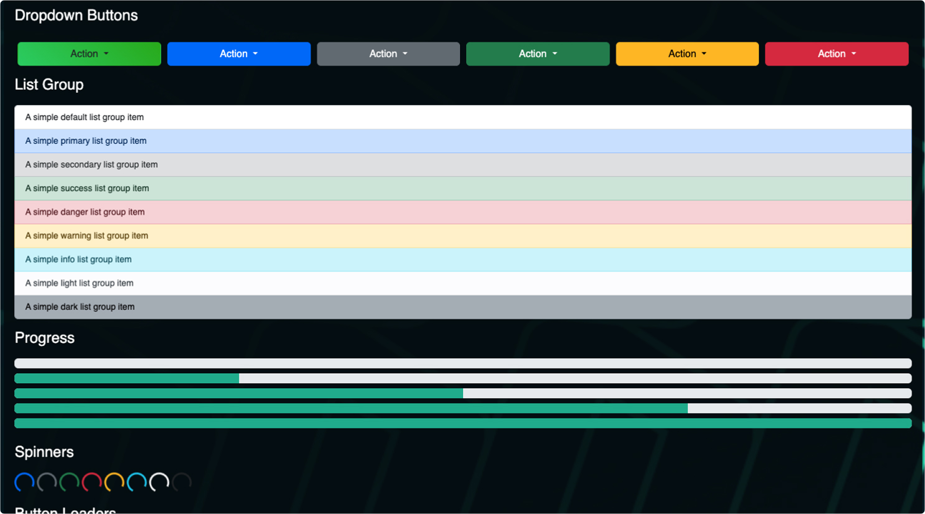
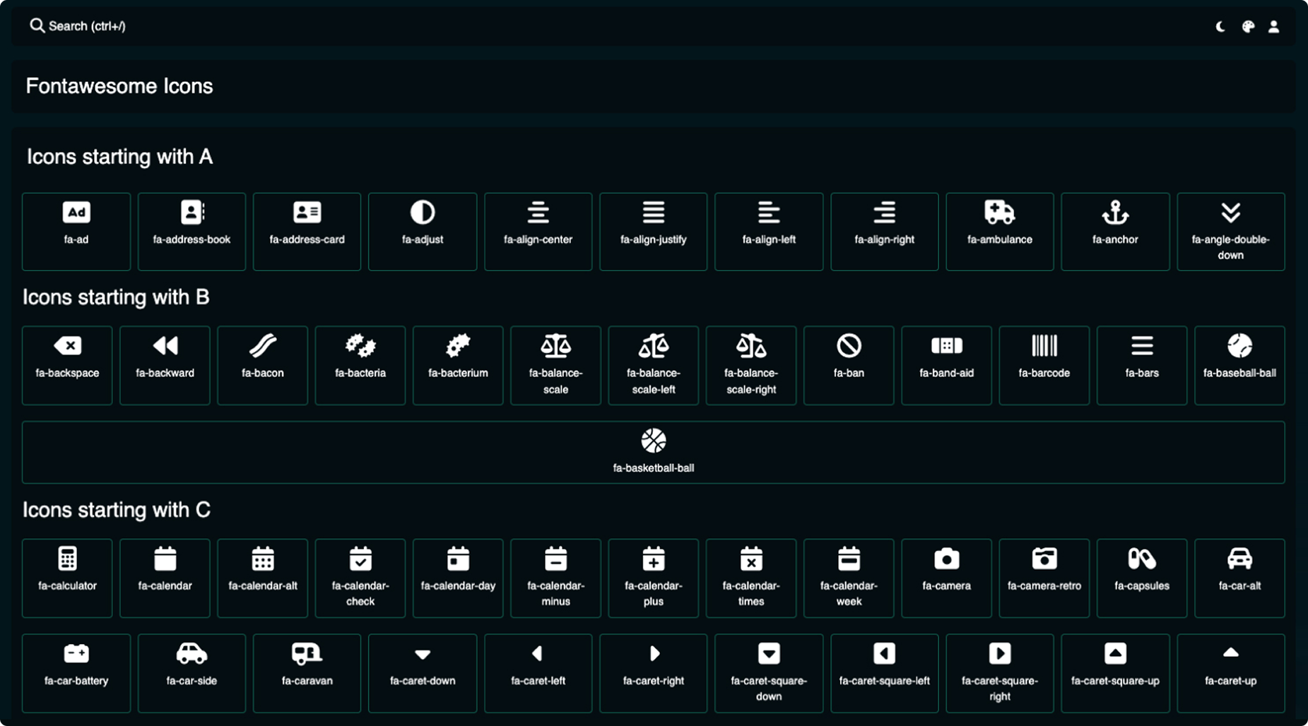
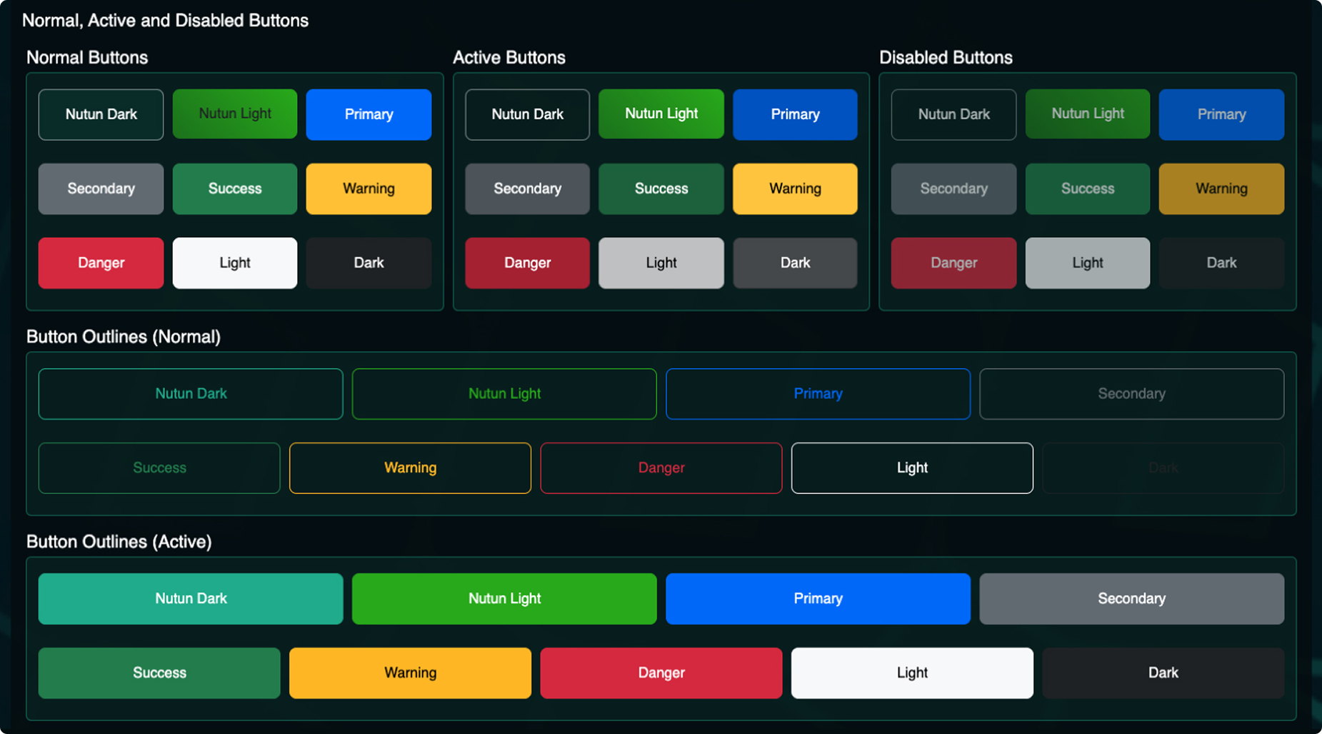
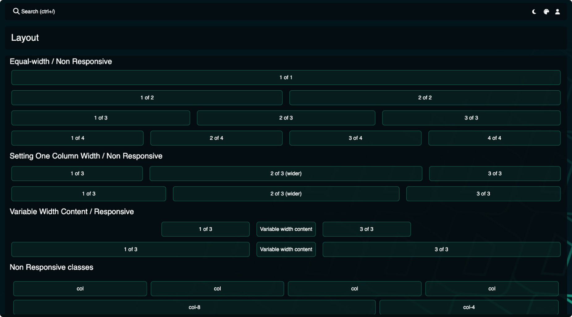
Nutun Bootstrap Theme
Designed with the Nutun brand guidelines in mind, this Bootstrap theme offers a robust foundation for building future business systems. Packed with a wide range of Bootstrap elements and functionalities, this template provides developers with a clear and adaptable framework.
HTML, CSS, Bootstrap, jQuery and JS
Gain insights
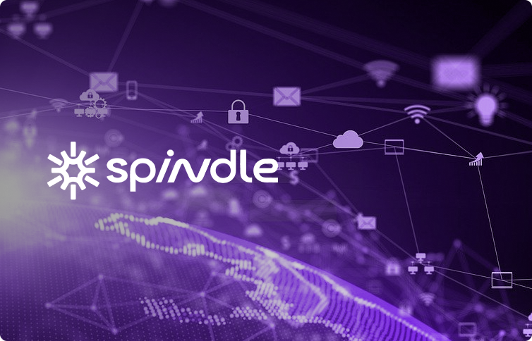
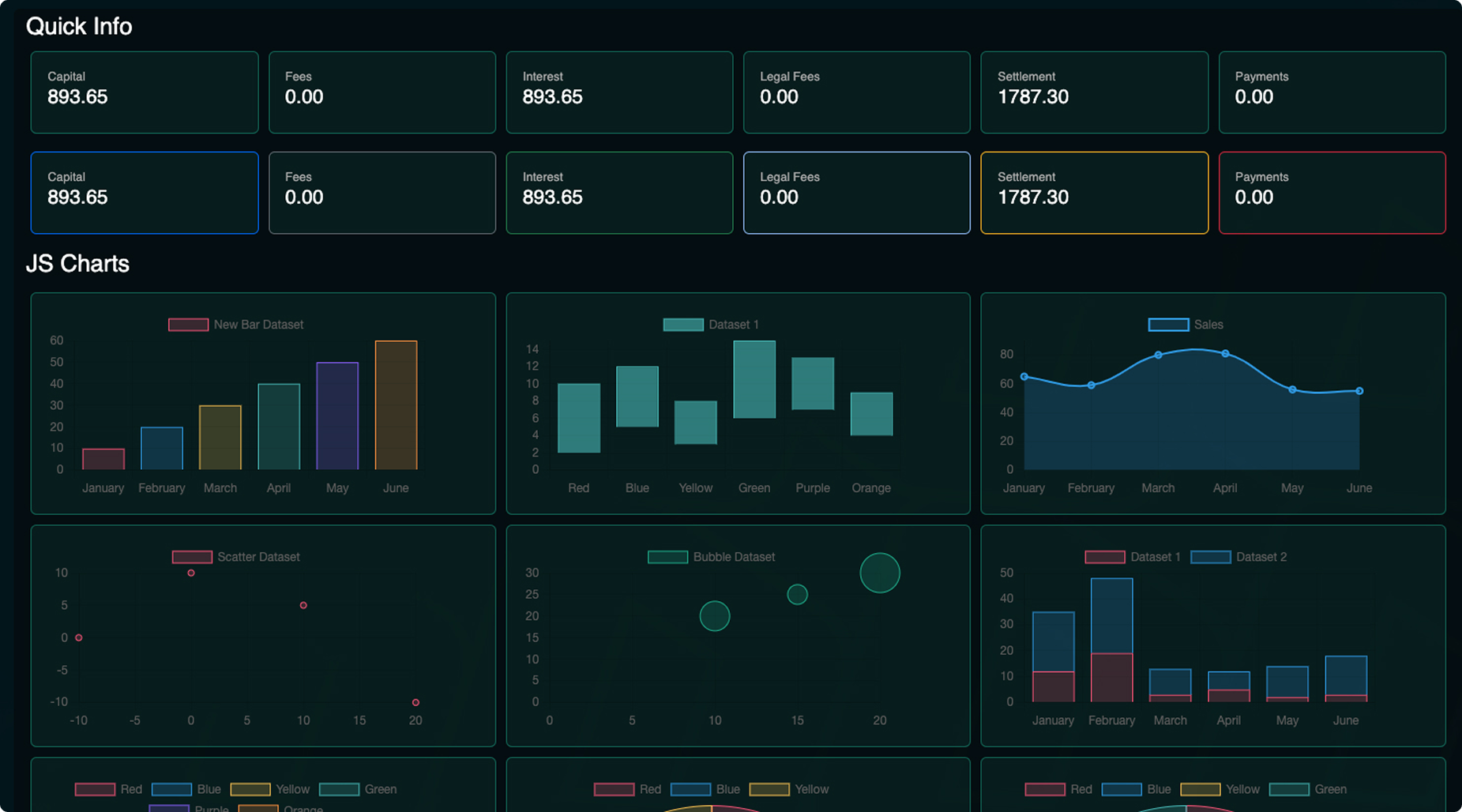
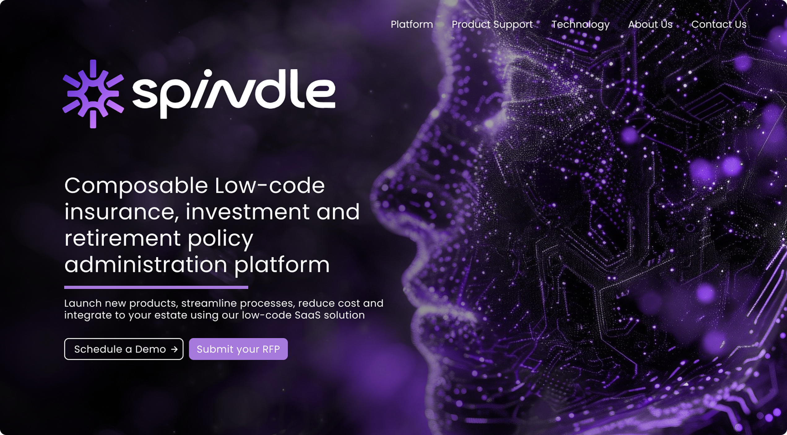
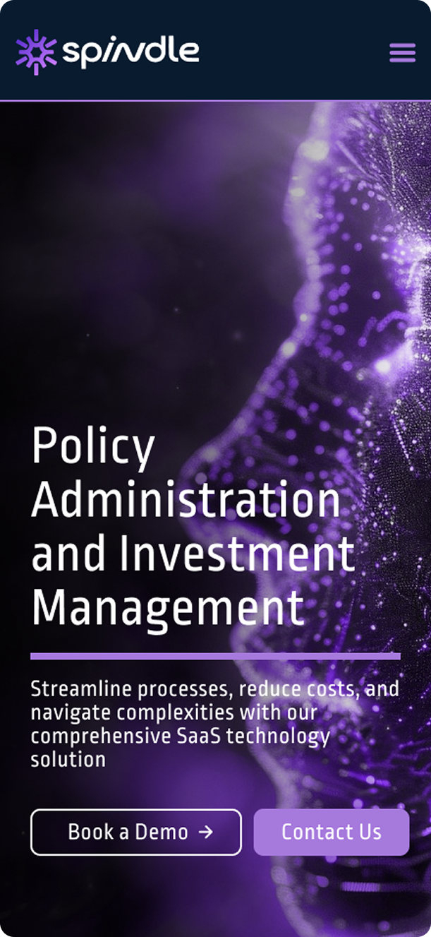
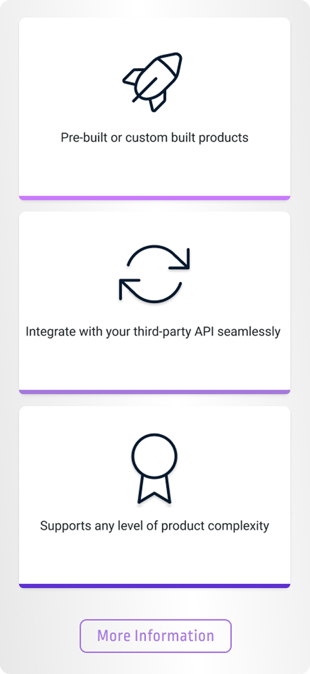
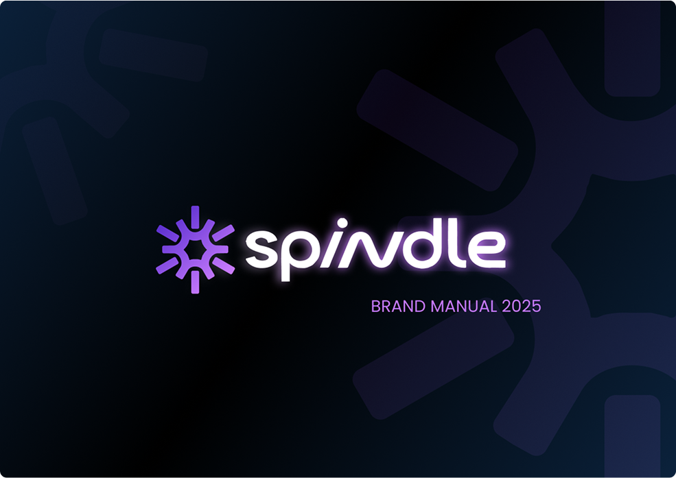
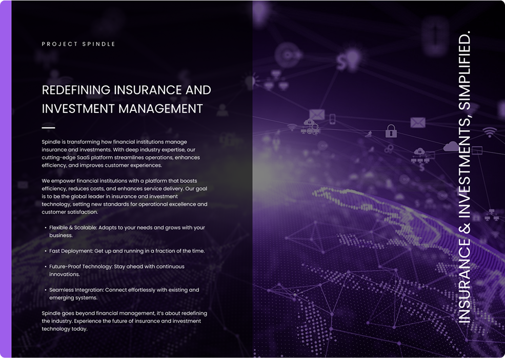
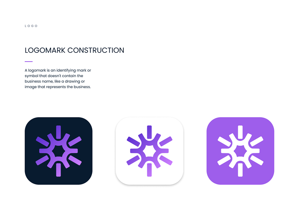
Spindle Platform
Spindle is a SaaS company specializing in policy administration and investment management solutions. Their platform aims to streamline insurance and investment processes, offering both pre-built and customizable products that integrate seamlessly with third-party APIs.
HTML, CSS, Bootstrap, jQuery and JS
Gain insights

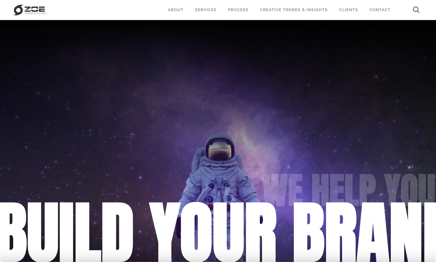
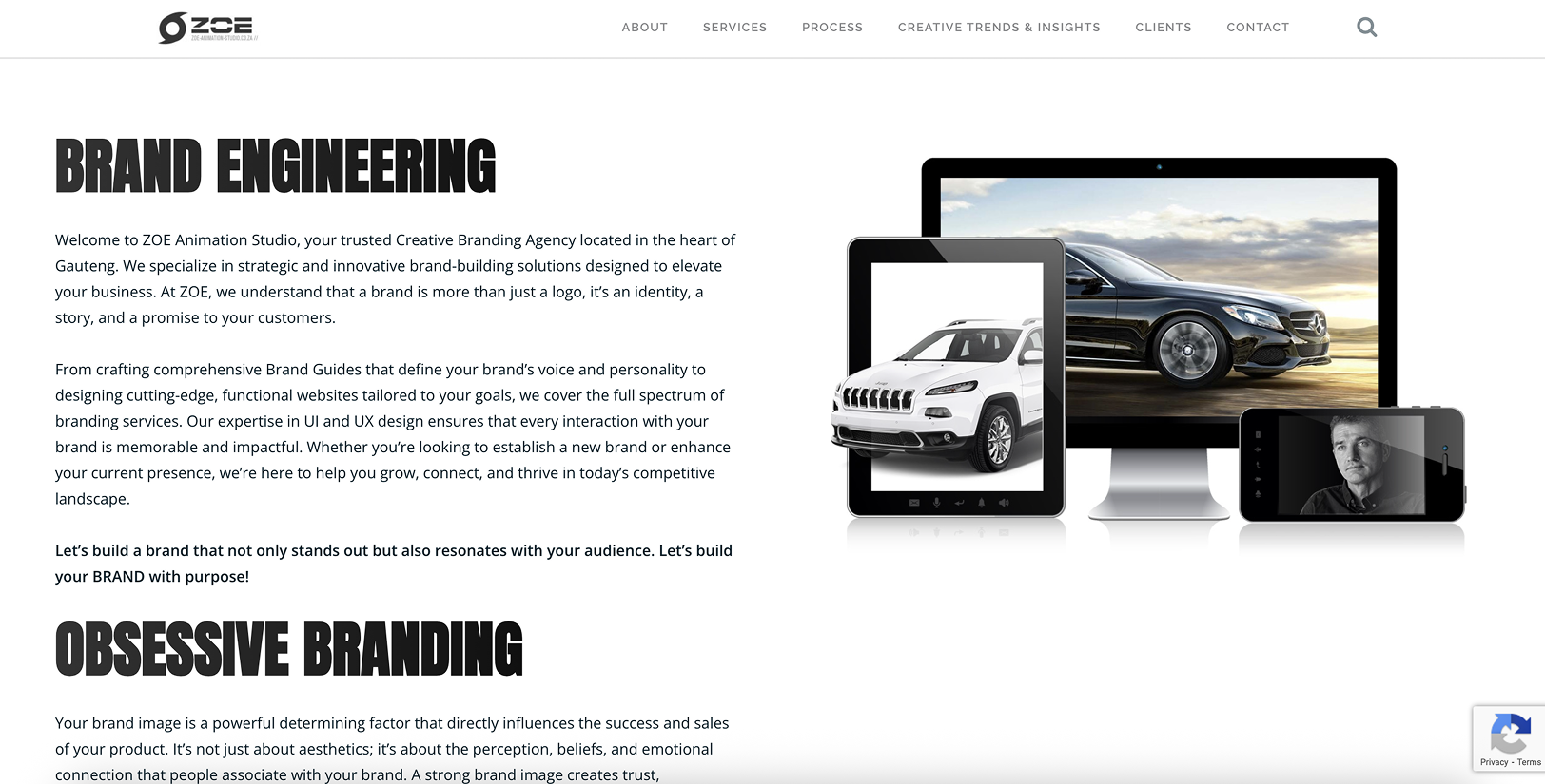
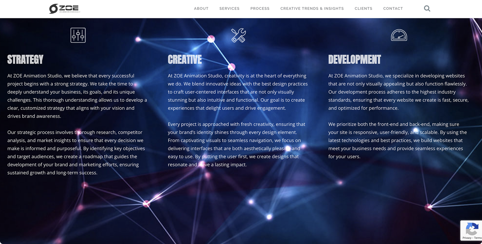
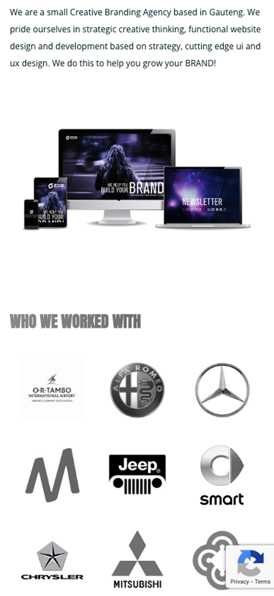
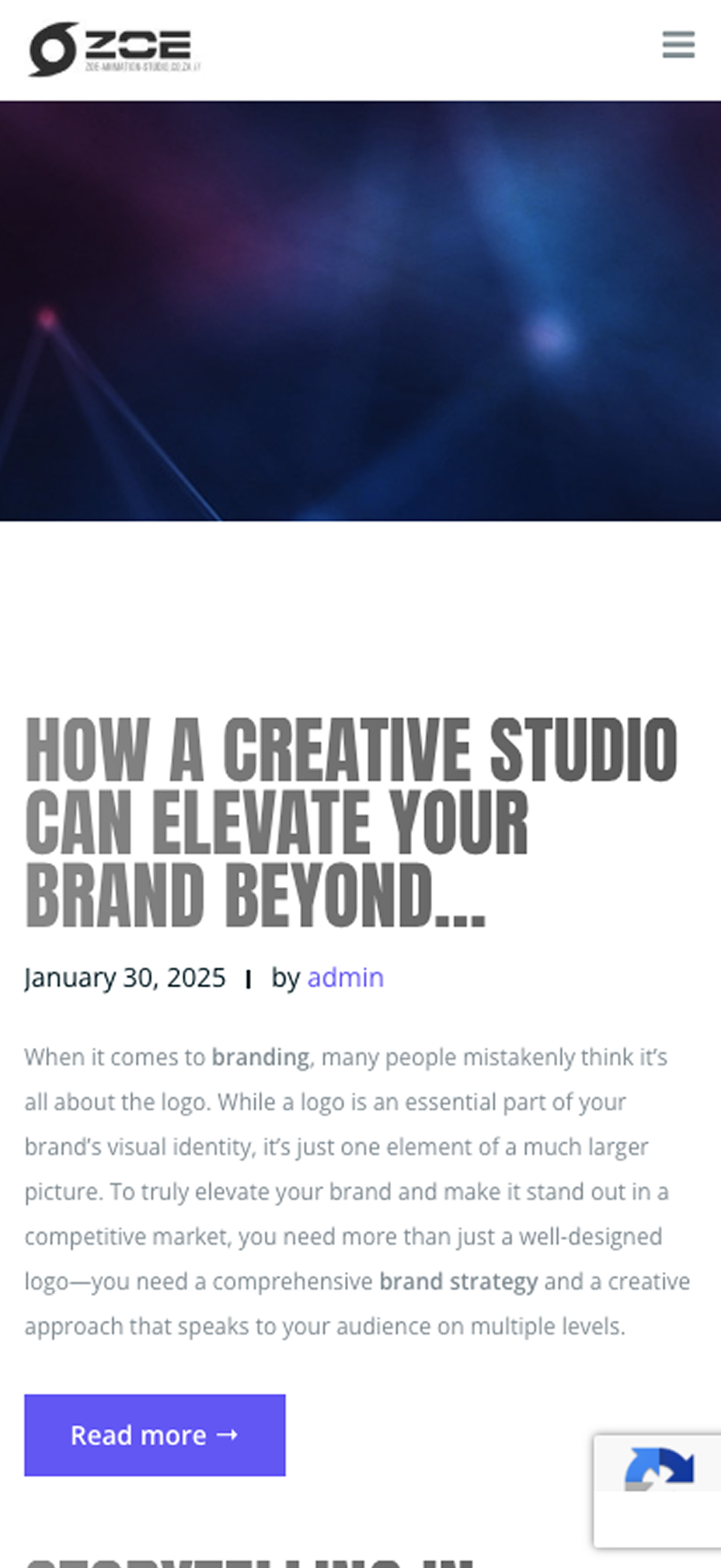
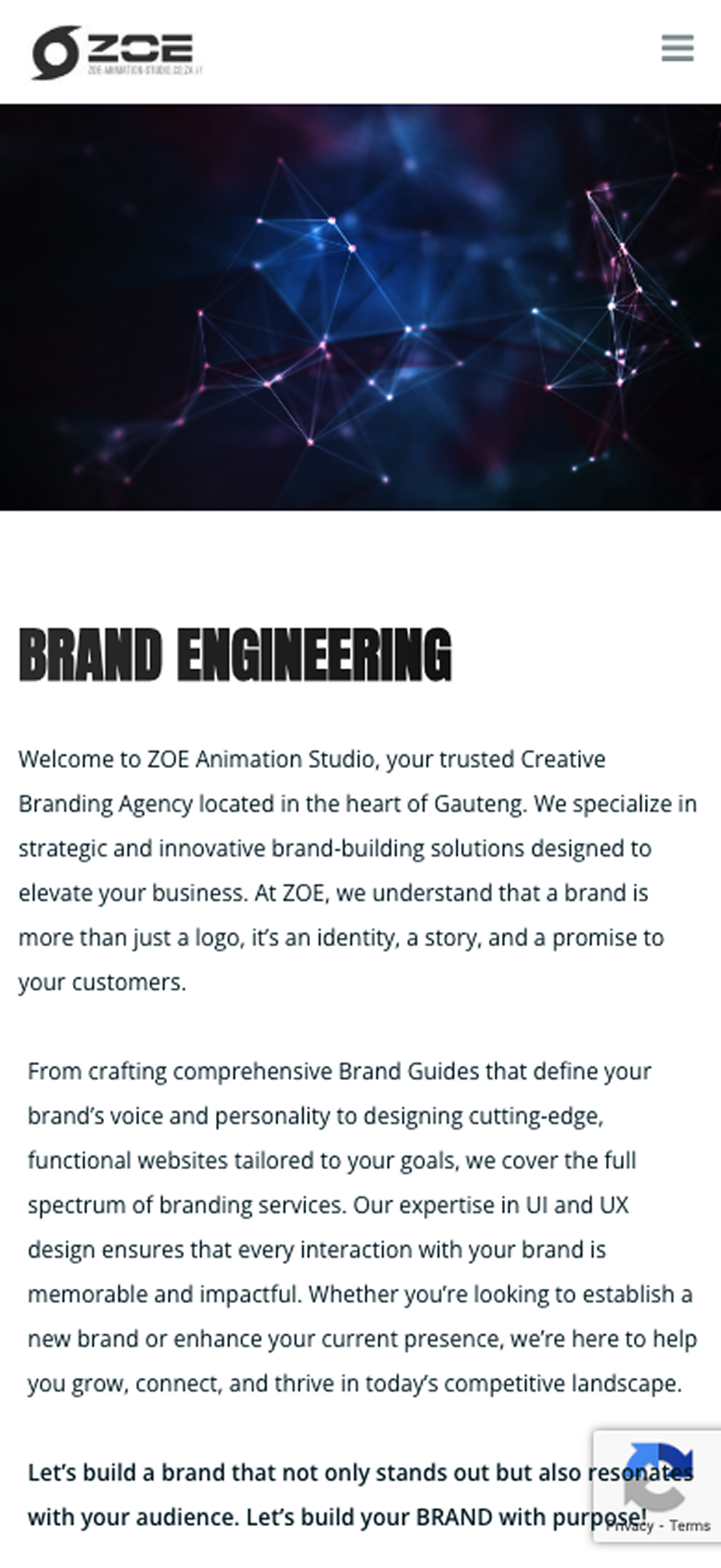
ZOE Animation Studio
A trusted Creative Branding Agency located in the heart of Gauteng. They specialize in strategic and innovative brand-building solutions designed to elevate your business.
Wordpress, CSS, HTML, jQuery, eCommerce
Gain insights